ADVERTISEMENT
Did you know that the same paint color can look different based on the time of day and lighting? Up to 50% of color perception changes due to lighting! It’s key to pick paint colors that work well with real light to make your home feel just right.
Whether you’re choosing the best paint colors for your home or refreshing a room, it’s important. You need to know how natural light from different directions and artificial lighting affects colors. This knowledge will help you choose the perfect colors for your spaces.
Key Takeaways
- Lighting can affect paint color perception by up to 50%.
- Natural light varies depending on the direction of windows.
- Understanding lighting helps in selecting the best paint colors for home.
- Artificial lighting types also impact how color is experienced.
- Testing colors in different lights is essential for making informed choices.
Understanding Color Theory
Color theory is crucial for choosing house paint colors. It shows how different colors change a room’s mood. Knowing about color wheels, warm vs. cool colors, and the role of neutrals helps. This knowledge lets you make great color palette ideas for your home.
The Basics of Color Wheels
Colors on the wheel are primary, secondary, and tertiary. Red, blue, and yellow are primary and mix to make secondary colors. These are green, orange, and purple. When you blend a primary and secondary, you get a tertiary color. This helps in picking paint colors that look good together.
Warm vs. Cool Colors
Warm colors like red, yellow, and orange make a room feel cozy and lively. They’re perfect for places where people gather, such as living rooms. Cool colors, including blues and greens, make a space calming. These are great for bedrooms or places to relax. Picking the right color temperature is key to good design.
The Role of Neutrals
Neutrals are essential for a balanced look. Beige, gray, and white make bold colors pop. They link different styles and patterns, making everything flow. Using neutrals smartly can enhance your color choices and make your home look seamless.

Assessing Your Space
Picking the right paint colors means more than liking a color. It’s about looking at your room closely. To choose the best colors for your walls, think about how light and space affect color. Here are key points to keep in mind:
Evaluating Lighting Conditions
Natural light changes how we see colors in a room. Rooms facing south get bright, warm sunlight, making colors look lively. On the other hand, rooms facing north get cooler light, which affects paint choices. It’s important to see how your room looks at different times to choose the best paint colors.
Considering Room Size and Shape
The size and shape of your room play a role in how colors feel. Light colors can make small rooms seem larger and brighter. Dark colors can make spaces feel snug and cozy. Think about your room’s shape and size when picking colors. This will help you make your space look its best.
Existing Furniture and Decor
The furniture and decor you already have should guide your color choices. Choose paint colors that match your style and furniture. If your furniture is bold, consider softer wall colors. This creates a balanced look that ties everything together nicely.

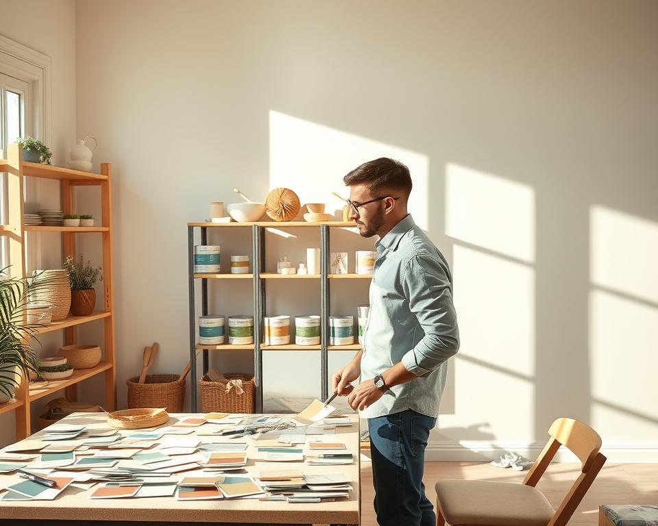
Testing Samples
Testing paint samples in your space is key. It shows how colors look under real light. You should apply samples directly on your walls. This lets you see how they’ll look over time. Experts always recommend this step to pick the right colors. It helps choose shades that fit your space just right.
Why You Should Always Test Paint
Testing paint before you buy can save you a lot. A color might look great in the store but different at home. Your room’s lighting, furniture, and size can change how colors look. Testing gives you a real feel of the mood and vibe different colors create.
Tips for Testing Paint Samples
- Purchase small sample pots from brands like Sherwin-Williams or Behr to try your chosen colors.
- Apply paint on a white board or directly on the wall. Make sure it covers at least a 2×2-foot area for a true feel.
- Look at the finish since different sheens can really change a color’s look.
Viewing Paint Colors at Different Times
Look at paint at different times to see how light changes its look. Morning light makes colors look bright. Evening light makes them look softer. This helps a lot when choosing paint for your home. It ensures your final choice looks great any time of day.
Choosing the Right Finish
Finding the perfect paint finish makes a big difference in a room’s appearance. Understanding the differences between finishes helps you choose what’s best for your style and needs. Here are key tips for picking wall paint colors based on the finish:
Glossy vs. Matte
Glossy finishes shine and last long. They are great for busy places like kitchens and bathrooms because they resist moisture. Matte finishes give a smooth, understated look. They cover wall flaws well, making them perfect for cozy spots like living rooms or bedrooms. Picking the best paint colors means thinking about how light interacts with the finish.
Satin and Eggshell: The Middle Ground
Satin and eggshell are in between glossy and matte. Satin has a gentle shine and is easy to clean, good for places like family rooms. Eggshell has a soft luster, offering great coverage. It’s ideal for achieving an elegant look without a bright shine. These finishes add flexibility to your design, letting you be creative with paint colors.
When to Use High-Gloss Finish
High-gloss is best for woodwork, trim, and cabinets. It makes details pop and lasts a long time. When picking paint colors for home upgrades, think about using high-gloss for accents. This creates striking contrasts and draws attention to special features.
Creating a Color Palette
Starting your paint color journey? A good color palette is your foundation. Using a few colors makes your space look united and calm. This balance adds visual appeal and harmony throughout your rooms.
Using a Limited Color Palette
Picking hues is easier with a limited palette. Sticking to a few colors can have amazing effects. For instance, combining three main colors can make everything look connected. This method keeps things focused and lets you mix textures without losing design harmony.
Complementary vs. Analogous Colors
Knowing how colors work together is key. Complementary colors, like blue and orange, sit opposite on the wheel and add energy. On the other hand, analogous colors, such as yellow and green, are side by side. They create a calm, harmonious vibe. Using them wisely can bring your color scheme to life.
Adding Accent Colors
Accent colors add excitement and depth. Use them to highlight things like art or cushions. They break the monotony while keeping things balanced. Look to fashion for ideas on using colors. This helps mood and style and shows how to pick paint colors that are true to you.
| Color Type | Description | Example Color Pairings |
|---|---|---|
| Complementary | Create contrast and vibrancy | Blue & Orange, Red & Green |
| Analogous | Foster harmony and tranquility | Yellow, Yellow-Green & Green |
| Accent | Add depth and interest | Bright Red in a Neutral Palette |
Inspiration Sources
Finding the right sources for home painting can make your space feel like an oasis. Nature offers a wide range of shades, textures, and combinations. These can elevate the look of any room.
Nature as a Palette
Nature’s colors, from vibrant sunsets to earth tones, inspire many paint trends. Think about using colors like lush greens, rustic browns, or tranquil blues. They can make your home feel calm and peaceful. A soft sage green, for example, can make a bedroom feel serene.
Finding Inspiration in Art and Fashion
Art and fashion are great for finding color combinations. Artists use bold colors to express feelings. Fashion trends introduce new colors often. Look at the latest fashion styles to find colors that match your style and home.
Utilizing Online Tools and Apps
Technology can help you in a new way when painting. Tools and apps like Sherwin-Williams’ ColorSnap or Benjamin Moore’s Personal Color Viewer help you see paint choices in your room. They help you pick colors confidently, matching the latest trends.
Trending Colors
The design world is always changing. In 2023, we see new favorite paint colors that homeowners love. Using the top paint colors makes your home look better and shows off your style. By keeping up with the latest trends, you can make any room look more modern and welcoming.
Popular Colors for 2023
This year, we’re seeing calm and bright colors. You’ll notice earthy colors like terracotta and olive green. They make rooms feel natural. Soft pastels are still in, giving rooms a soft touch. Bold colors like deep blues and rich burgundies are in too. They catch your eye but don’t overpower a room. These colors aim to make living spaces comforting and peaceful.
How to Incorporate Trendy Hues
Adding trendy colors to your home can be easy. Try painting an accent wall with a current color for a big impact. Adding art, cushions, or rugs in these colors can boost the effect. For a smaller change, using accessories lets you try out new paint trends without a big commitment.
Classic Colors That Never Go Out of Style
Even with new trends, classic colors remain essential in home design. Soft whites, classic greys, and rich navy are always in style. They work with any decor and let you add trendy colors easily. Mixing in these timeless colors with new ones keeps your home looking good over time.
Considering Mood and Emotion
The right paint colors can really change how a room feels. It’s important to know how colors change our feelings. This helps choose colors that fit what each room is for. By doing this, you can make any space more inviting and cozy. Here are some simple tips for picking wall paint colors that consider mood.
How Colors Affect Mood
Colors make us feel different things. Warm colors like red and orange bring energy and excitement. Cool colors like blue and green can make us feel calm and peaceful. Knowing what these colors do can help you pick the right ones for the feel you want in your room.
Color Psychology Made Simple
- Red: Makes us feel more energetic and excited.
- Blue: Calms us down and helps us focus.
- Yellow: Makes us happier and more optimistic.
- Green: Reminds us of nature and relaxes us.
- Purple: Boosts creativity and imagination.
Choosing Colors for Different Room Purposes
Every room has its own purpose, so the colors should match that. Use bright, lively colors in work areas to help you stay productive. Bedrooms should have softer, calming colors to help you sleep. Pick welcoming colors for living rooms to spark conversation and togetherness. These tips can really help you match each room’s mood with the right colors.
Making Color Combinations Work
Combining colors in your home is both fun and a bit tricky. To get a look that feels right, it’s important to understand undertones. Using colors that go well together is key to setting the mood you want. This part talks about how to choose colors that match well, avoid ones that clash, and use layers of colors for depth. Learn how ideas for painting color schemes can help you pick paint colors that look great together.
Matching Colors with Undertones
Colors have undertones that could be warm, cool, or neutral. Knowing these undertones is key to making smooth color schemes. For instance, with beige, see if it has a pink (warm) or green (cool) feel. This makes pairing it with other colors easier. Use things like color samples and swatches to study undertones in sunlight before choosing your colors.
Avoiding Clashing Colors
Without a plan, mixing colors can cause a look that’s too much and clashes. Stick with a simple rule of three: one main color and two that complement it. If your main color is a bright blue, match it with a gentle gray and a cozy white. This keeps the area unified but still interesting.
Creating Depth with Layering Colors
Adding layers of colors makes your rooms more interesting and complex. Start with a basic color on your walls. Then use darker colors close to the ground, like on baseboards or furniture. Finish with lighter colors on ceilings or decorative pieces to make sure your scheme works together and looks good. This strategy creates more engaging spaces that show off your personal style.
| Color | Undertone | Best Pairing |
|---|---|---|
| Warm Beige | Pink | Soft White, Light Brown |
| Cool Gray | Blue | Charcoal, Soft Yellow |
| Rich Blue | Cool | Light Gray, Cream |
Following these tips on painting color schemes will lead to beautiful results in your space. With some thought, you can change any room with color combinations that stand out.
Finalizing Your Choices
After you’ve chosen colors for your home, take a moment to think about those decisions. Evaluating your choices is key to finding the best paint colors that match your style. Check if the colors look good together in different rooms.
Reviewing Your Selections
First, look again at the colors you picked. Make sure they look good in the light of each room. Now is a good time to ask for professional advice on colors. Another person’s view can help you fine-tune your choices and make you sure about them.
Ensuring Cohesion Throughout Your Home
Think about how colors move from room to room. A united color scheme makes your home look better. Try to blend bold and quiet colors to create harmony while keeping each room unique.
Getting Feedback from Friends or Family
Feel free to get thoughts from friends or family. They might share helpful ideas or tips from their own experiences. Their opinions can confirm your choices or push you to think about new options. Using the views of others helps you make well-rounded decisions.
Working with Professionals
Getting help from pros can really make your painting project shine. They know when to step in to save you time and cut down on stress. These experts offer custom strategies for picking the perfect paint colors for your space. This part talks about why talking to an interior designer or color expert is smart. Plus, it gives you hints on how to work well with a painter for awesome results.
When to Hire an Interior Designer
Feeling lost in a sea of color options? An interior designer could be just what you need. They can pinpoint what you like and come up with unique ideas. Getting pro advice helps you tackle tricky choices, like making different rooms flow together or matching paint with your house’s style.
Benefits of Consulting a Color Expert
Color experts know how colors work together in a room. They make picking paint simpler, so your choices match your furniture and decor. They’re also great at spotting trends and timeless colors, making it easier for you to decide.
How to Collaborate with a Painter
Working closely with your painter can bring great results. Talk about your vision and the colors you like before starting. Share your ideas and listen to their advice on finishes and styles. Clear talks help avoid mix-ups and make sure the painter gets what you’re aiming for.
| Role | Key Responsibilities | Why You Need Them |
|---|---|---|
| Interior Designer | Creates cohesive design plans, selects colors and finishes | Aligns your vision with functionality and aesthetics |
| Color Expert | Advises on color interactions, compositions, and trends | Offers professional advice on picking paint colors |
| Painter | Executes the painting tasks based on the chosen colors | Ensures that the final appearance matches your expectations |
Maintenance and Longevity
When you start thinking about home décor, think beyond just the initial colors. Consider their durability and how much upkeep they’ll need. Choosing durable paints can mean fewer touch-ups. This helps keep the best colors looking fresh for longer. High-quality paints hold up better against wear and tear. They’re great for areas that get a lot of use or sunlight.
Choosing Durable Paints
Using strong paints, like those from Sherwin-Williams or Benjamin Moore, leads to longer-lasting results. These brands have finishes that look good and resist fading and chipping. With the right paint, your choice of color stays vibrant with less effort.
How Lighting Changes Over Time
Remember, lighting in your home changes with seasons and throughout the day. Colors that look great in daylight might seem different under lamps or LED lights. Check how different lights affect your colors. This helps you update your look as needed. Staying flexible lets your home’s style adapt without losing its charm.
Refreshing Your Colors for a New Look
Styles change, and you might want to update your space. A new accent wall or some trendy colors can refresh your home easily. Make small changes that fit the latest trends but don’t overwhelm. Trying new colors is a simple way to give your space a new vibe.